# library(tidyverse)
library(ggplot2)Bonusseminar 1: Grafische Darstellungen mit ggplot2
The grammar of graphics: ggplot2
Literatur zum Nachlesen
Kapitel data visualization in R for data science
Data visualization with ggplot2 (https://rstudio.github.io/cheatsheets/data-visualization.pdf)
Vorbereitung
R Pakete
ggplot2
Anstatt das {ggplot2} Paket einzeln zu laden, könnten wir auch direkt das gesamte {tidyverse} benutzen.
palmerpenguins
library(palmerpenguins)Das {palmerpenguins} Paket enthält den Datensatz penguins.
Funktionsweise von ggplot2
- Erstelle ein plot object
ggplot(data = penguins)
- Definiere die aesthetics
ggplot(data = penguins,
       mapping = aes(x = flipper_length_mm, y = body_mass_g))
- Stelle Daten mit einem geom dar
ggplot(data = penguins,
       mapping = aes(x = flipper_length_mm, y = body_mass_g)) +
  geom_point()
Warning: Removed 2 rows containing missing values or values outside the scale range
(`geom_point()`).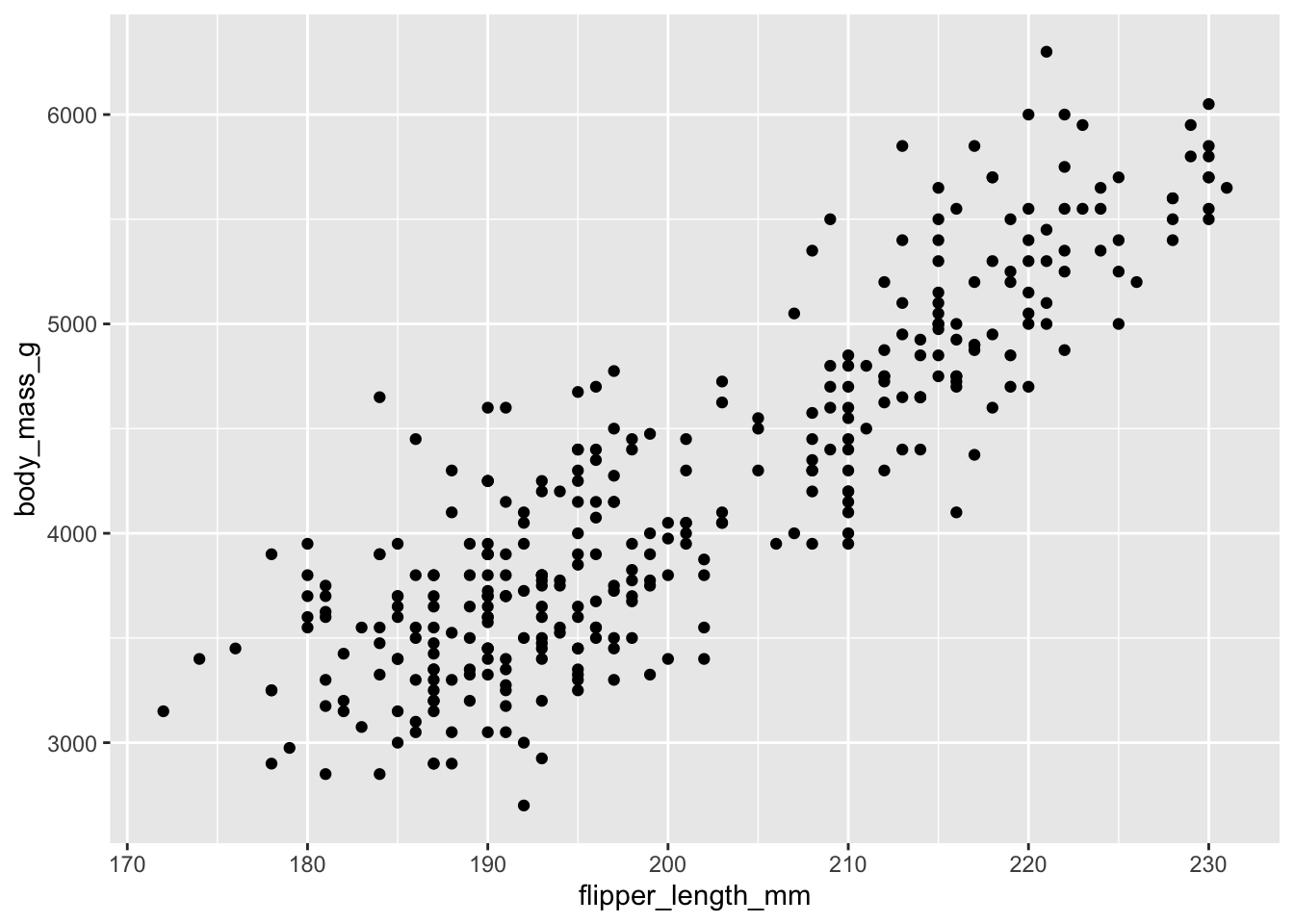
- Füge zusätzliche layers hinzu
ggplot(data = penguins,
       mapping = aes(x = flipper_length_mm, y = body_mass_g)) +
  geom_point() +
  geom_smooth(method = "lm", se = FALSE)
`geom_smooth()` using formula = 'y ~ x'Warning: Removed 2 rows containing non-finite outside the scale range
(`stat_smooth()`).Warning: Removed 2 rows containing missing values or values outside the scale range
(`geom_point()`).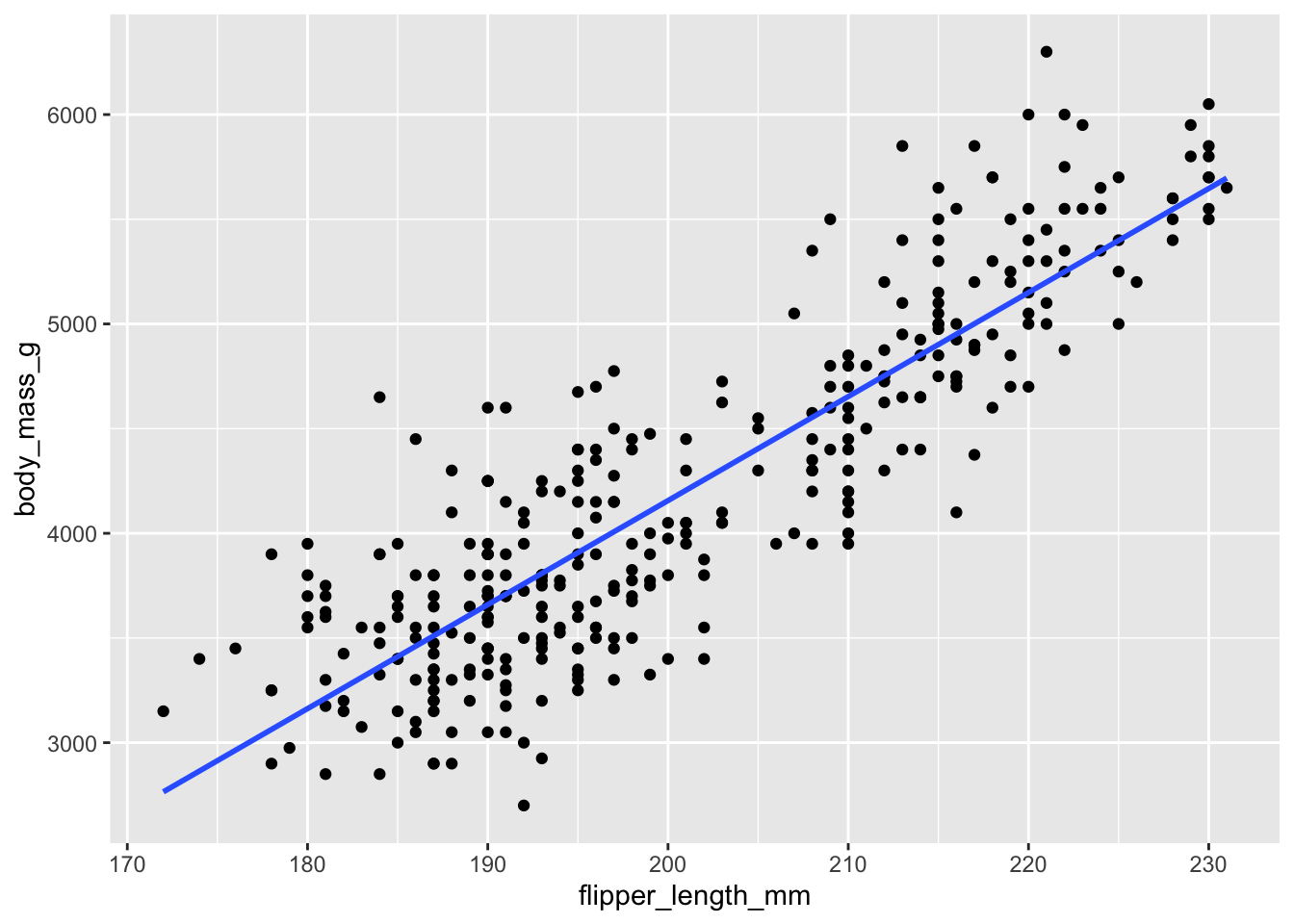
- Optional: Füge labels, themes, etc. hinzu
ggplot(data = penguins,
       mapping = aes(x = flipper_length_mm, y = body_mass_g)) +
  geom_point() +
  geom_smooth(method = "lm", se = FALSE) +
  labs(title = "Flipper length and body mass",
       x = "Flipper length (mm)",
       y = "Body mass (g)") +
  theme_minimal()
`geom_smooth()` using formula = 'y ~ x'Warning: Removed 2 rows containing non-finite outside the scale range
(`stat_smooth()`).Warning: Removed 2 rows containing missing values or values outside the scale range
(`geom_point()`).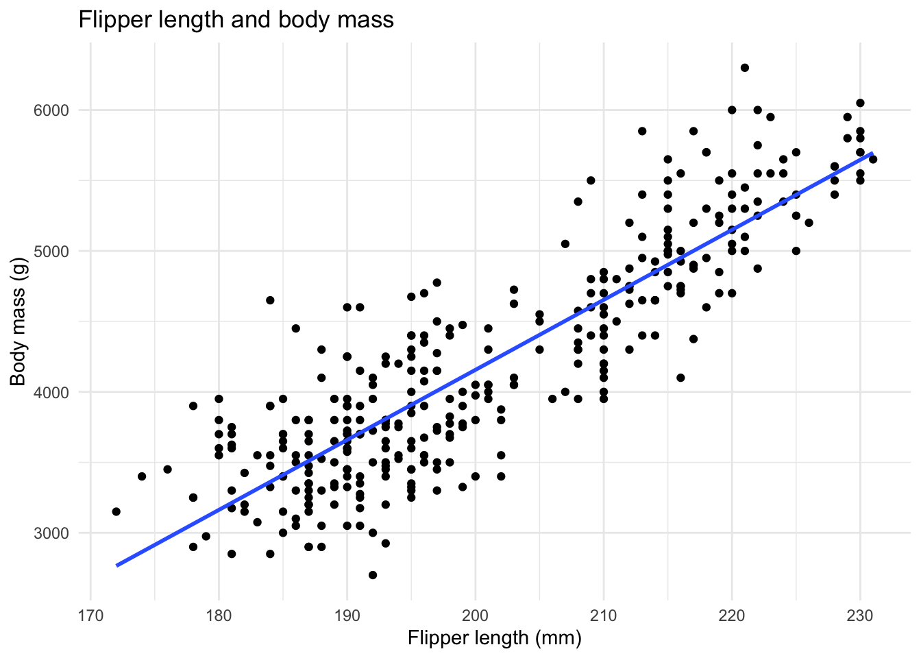
- Optional: Modifiziere beliebige Details!
ggplot(data = penguins,
       mapping = aes(x = flipper_length_mm, y = body_mass_g)) +
  geom_point(aes(shape = island)) +
  geom_smooth(method = "lm", se = FALSE, color = "purple") +
  labs(title = "Flipper length and body mass",
       subtitle = "for penguins from different islands",
       x = "Flipper length (mm)",
       y = "Body mass (g)",
       shape = "Island") +
  theme_minimal()
`geom_smooth()` using formula = 'y ~ x'Warning: Removed 2 rows containing non-finite outside the scale range
(`stat_smooth()`).Warning: Removed 2 rows containing missing values or values outside the scale range
(`geom_point()`).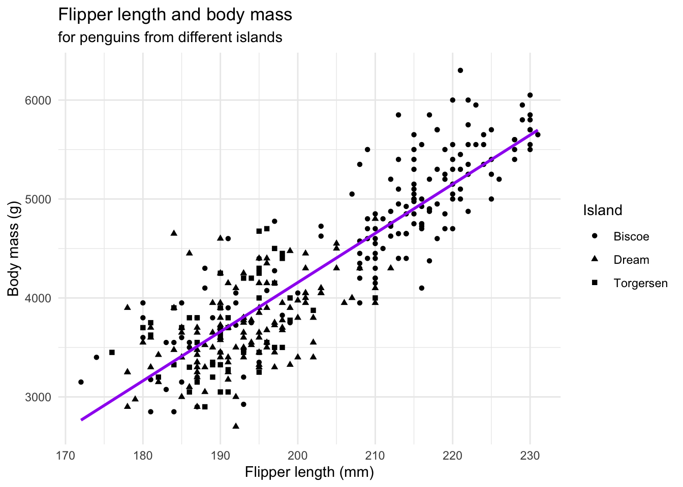
Unsere Standardplots
Histogramme
Der Grundbaustein für Histogramme ist geom_histogram().
ggplot(data = penguins, aes(x = flipper_length_mm)) +
  geom_histogram()
`stat_bin()` using `bins = 30`. Pick better value with `binwidth`.Warning: Removed 2 rows containing non-finite outside the scale range
(`stat_bin()`).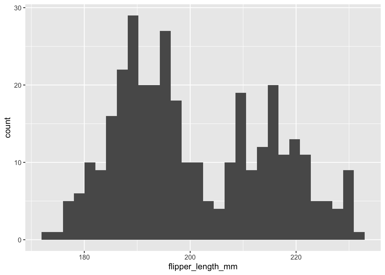
Boxplots
Der Grundbaustein für Boxplots ist geom_boxplot().
ggplot(data = penguins, aes(x = flipper_length_mm)) +
  geom_boxplot()
Warning: Removed 2 rows containing non-finite outside the scale range
(`stat_boxplot()`).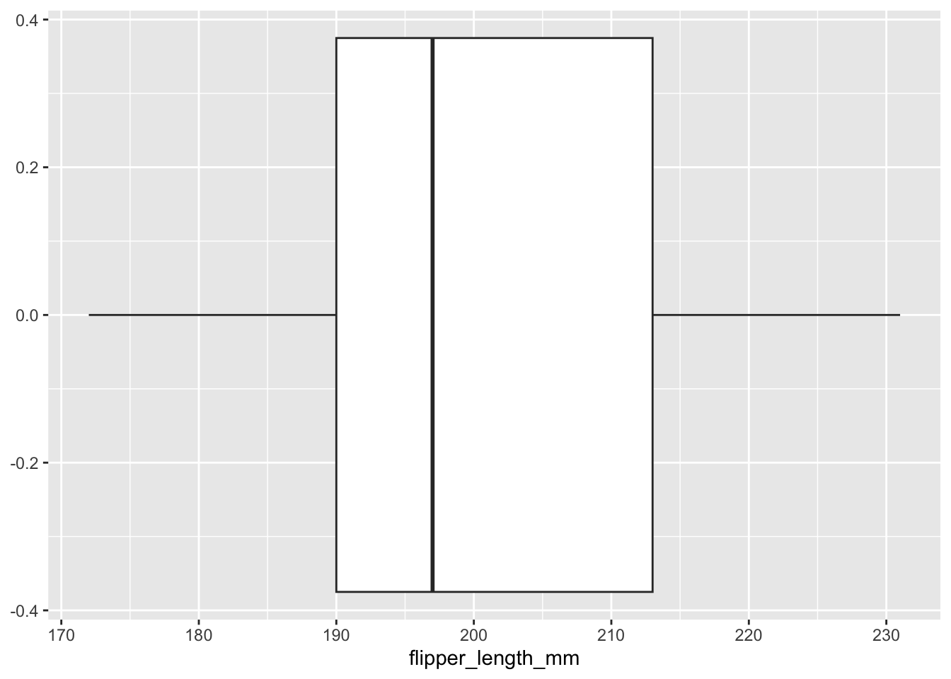
Streudiagramme
Wie wir schon gesehen haben, ist der Grundbaustein von Streudiagrammen geom_point().
ggplot(data = penguins,
       mapping = aes(x = flipper_length_mm, y = body_mass_g)) +
  geom_point()
Warning: Removed 2 rows containing missing values or values outside the scale range
(`geom_point()`).
Übungen
Erstellen Sie die drei Standardplots mit einer anderen Variable (bzw. Kombination von Variablen) aus dem
penguinsDatensatz.TippLösungBeispiele:
ggplot(data = penguins, aes(x = bill_length_mm)) +
  geom_histogram()
`stat_bin()` using `bins = 30`. Pick better value with `binwidth`.Warning: Removed 2 rows containing non-finite outside the scale range (`stat_bin()`).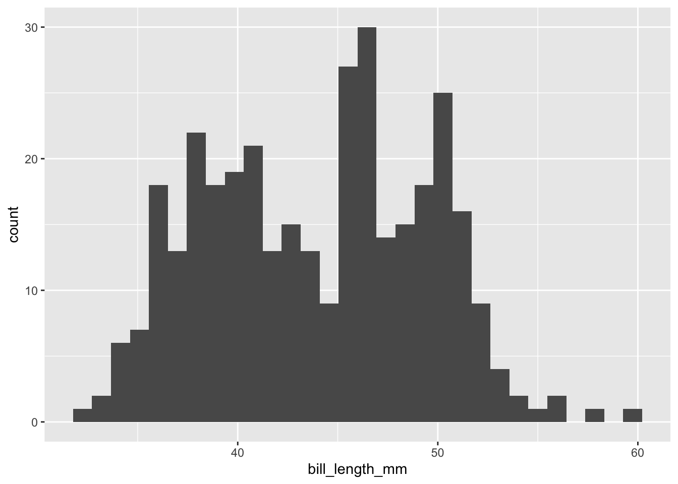
ggplot(data = penguins, aes(x = bill_length_mm)) +
  geom_boxplot()
Warning: Removed 2 rows containing non-finite outside the scale range (`stat_boxplot()`).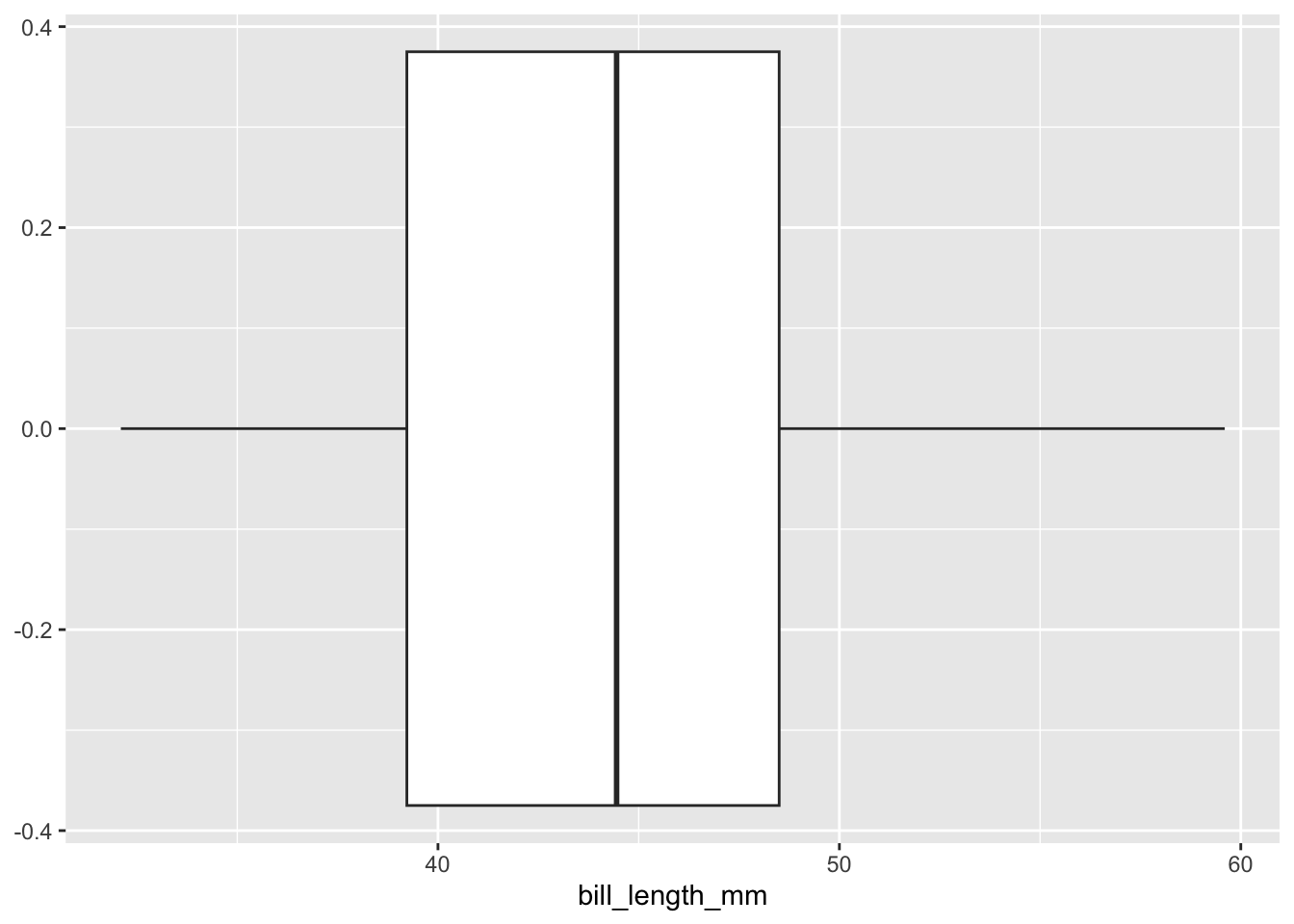
ggplot(data = penguins,
   mapping = aes(x = bill_length_mm, y = bill_depth_mm)) +
geom_point()
Warning: Removed 2 rows containing missing values or values outside the scale range (`geom_point()`).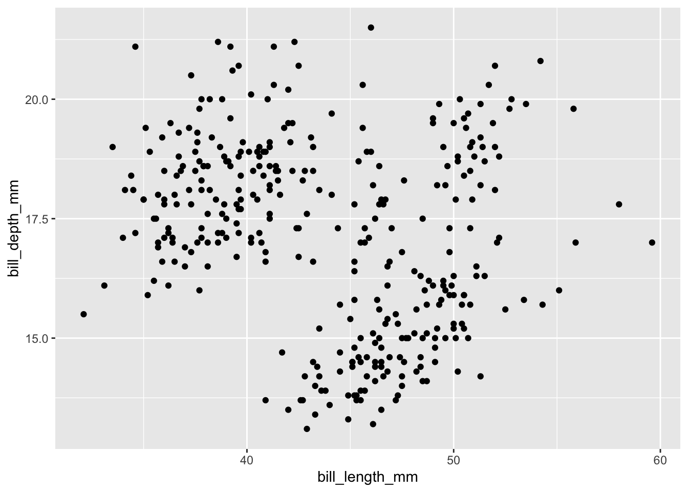
Nehmen wir an, wir interessieren uns für den (linearen) Zusammenhang zwischen der Schnabellänge und der Schnabeltiefe der Pinguine im
penguinsDatensatz:cor(penguins$bill_length_mm, penguins$bill_depth_mm, use = "complete.obs")[1] -0.2350529Versuchen Sie mithilfe von Grafiken herauszufinden, warum diese Korrelation irreführend sein könnte.
TippLösungWenn wir das dazu gehörige Streudiagramm betrachten, fällen uns vielleicht komische Punktewolken auf:
ggplot(data = penguins,
       aes(x = bill_length_mm, y = bill_depth_mm)) +
  geom_point() +
  geom_smooth(method = "lm", se = FALSE) +
  labs(title = "Penguin bill dimensions",
    subtitle = "Palmer Station LTER",
    x = "Bill length (mm)",
    y = "Bill depth (mm)") +
  theme(plot.title.position = "plot",
    plot.caption = element_text(hjust = 0, face= "italic"),
    plot.caption.position = "plot")
`geom_smooth()` using formula = 'y ~ x'Warning: Removed 2 rows containing non-finite outside the scale range (`stat_smooth()`).Warning: Removed 2 rows containing missing values or values outside the scale range (`geom_point()`).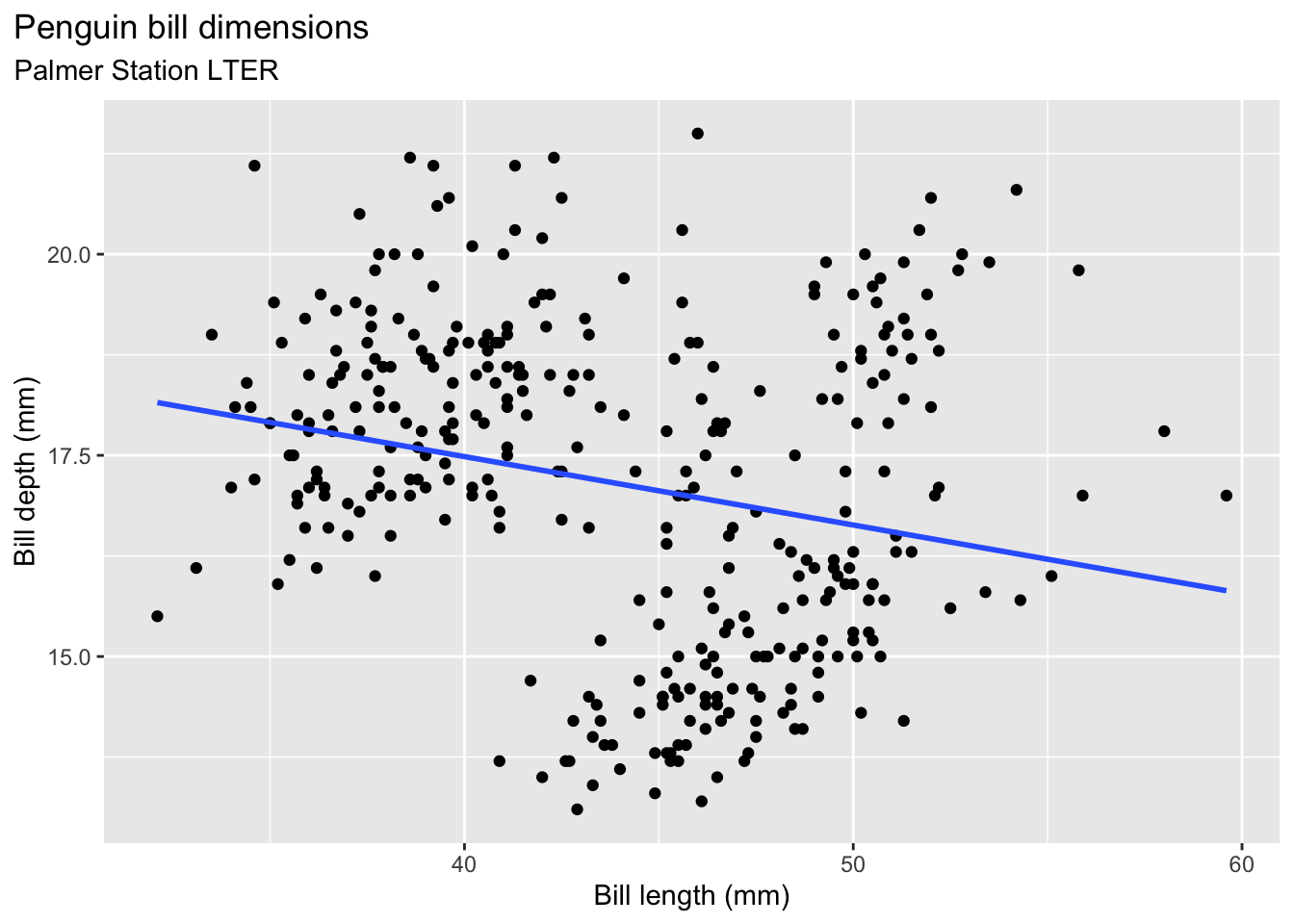
Tatsächlich kommt der negative Zusammenhang nur durch die verschiedenen Spezies der Pinguine zustande. Innerhalb jeder Spezies ist der Zusammenhang positiv:
ggplot(data = penguins,
       aes(x = bill_length_mm, y = bill_depth_mm, group = species)) +
  geom_point(aes(color = species,
    shape = species),
    size = 3,
    alpha = 0.8) +
  geom_smooth(method = "lm", se = FALSE, aes(color = species)) +
  scale_color_manual(values = c("darkorange","purple","cyan4")) +
  labs(title = "Penguin bill dimensions",
    subtitle = "Bill length and depth for Adelie, Chinstrap and Gentoo Penguins at Palmer Station LTER",
    x = "Bill length (mm)",
    y = "Bill depth (mm)",
    color = "Penguin species",
    shape = "Penguin species") +
  theme(legend.position.inside = c(0.85, 0.15),
    plot.title.position = "plot",
    plot.caption = element_text(hjust = 0, face= "italic"),
    plot.caption.position = "plot")
`geom_smooth()` using formula = 'y ~ x'Warning: Removed 2 rows containing non-finite outside the scale range (`stat_smooth()`).Warning: Removed 2 rows containing missing values or values outside the scale range (`geom_point()`).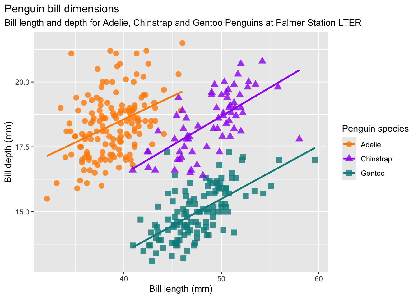
Dieses Phänomen wird in der Literatur manchmal als Ökologischer Trugschluss bezeichnet.
Suchen Sie sich einen der Standardplots aus und überlegen Sie sich eine interessante Erweiterung (z.B. Verwendung von Farben, Formen, Gruppierungsvariablen, Beschriftungen, …). Erstellen Sie eine grobe Skizze auf einem Blatt Papier (oder Tablet). Versuchen Sie, den Plot mithilfe von Google und/oder ChatGPT umzusetzen.
TippLösungBeispiele:
ggplot(data = penguins, aes(x = flipper_length_mm)) +
  geom_histogram(aes(fill = species),
    alpha = 0.5,
    position = "identity") +
  scale_fill_manual(values = c("darkorange","purple","cyan4")) +
  labs(x = "Flipper length (mm)",
    y = "Frequency",
    title = "Penguin flipper lengths")
`stat_bin()` using `bins = 30`. Pick better value with `binwidth`.Warning: Removed 2 rows containing non-finite outside the scale range (`stat_bin()`).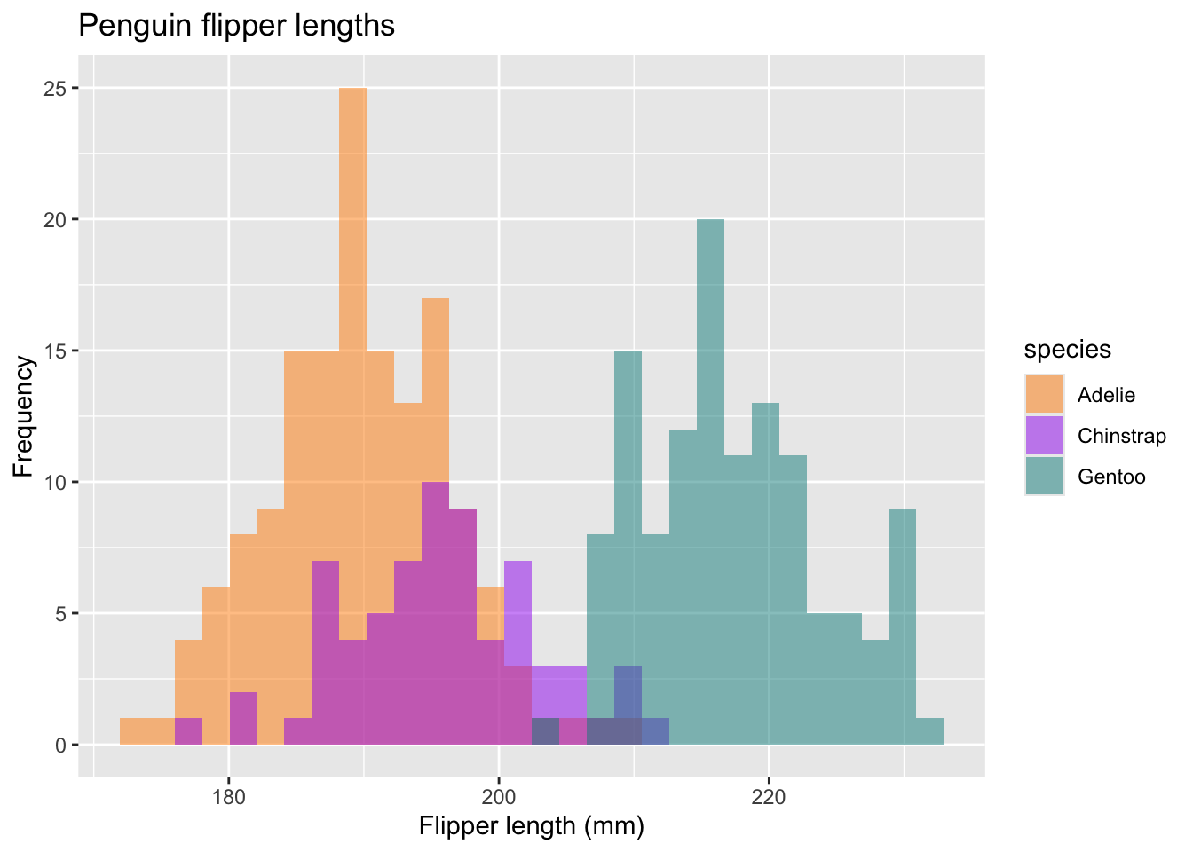
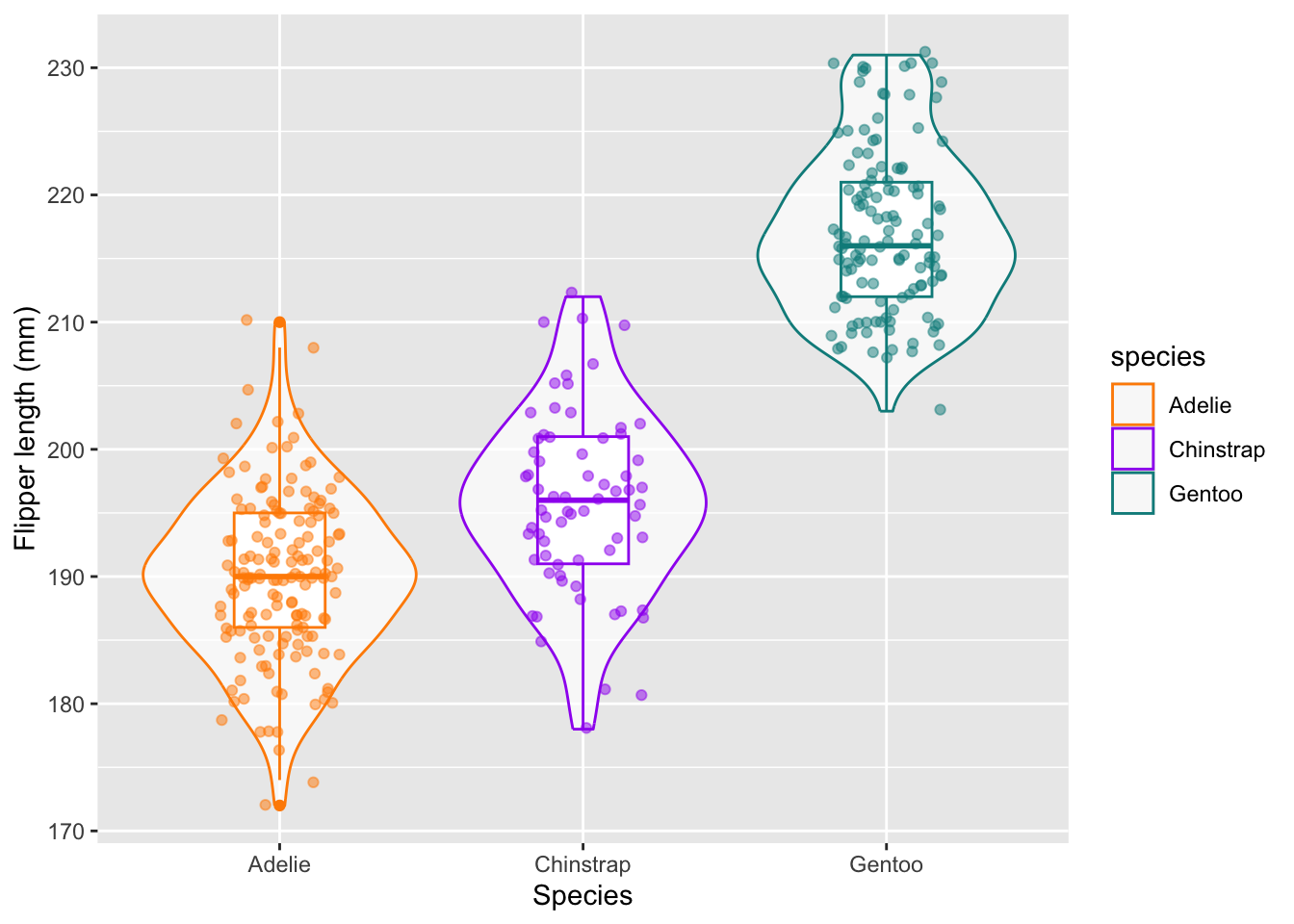
ggplot(data = penguins,
       aes(x = species, y = flipper_length_mm, color = species)) +
  geom_violin(alpha = 0.7) +
  geom_boxplot(width = 0.3, show.legend = FALSE) +
  geom_jitter(alpha = 0.5, show.legend = FALSE, position = position_jitter(width = 0.2, seed = 0)) +
  scale_color_manual(values = c("darkorange","purple","cyan4")) +
  labs(x = "Species",
    y = "Flipper length (mm)")
Warning: Removed 2 rows containing non-finite outside the scale range (`stat_ydensity()`).Warning: Removed 2 rows containing non-finite outside the scale range (`stat_boxplot()`).Warning: Removed 2 rows containing missing values or values outside the scale range (`geom_point()`).